When it comes to design portfolios I believe that having a tactile and online portfolio is beneficial. Designing tactile and online portfolios can be overwhelming because there are so many different options on how they can be designed. I have found examples of both types of portfolios and considered the pros and cons of each.
Tactile Portfolios
Fanfankula’s Tactile Portfolio


This portfolio is made out of two pieces of plexiglass screwed together and all the work is contained in black cardboard folders. The folders have little pockets for the work to sit in, and this allows for whoever is reviewing the portfolio to take the pieces out and get a closer look. The portfolio itself is eye-catching and the folders allow for work to be changed in and out to make the portfolio relevant to the job being applied for. The only downside to this portfolio is that it may be heavy and hard to carry around.


Jenna’s portfolio is a handcrafted carrying case that has drawers for her portfolio book and promotional pieces. Her portfolio book is made from engraved and die-cut acrylic. Her work is displayed throughout the printed pages of the book. I think that the case is nice because it keeps everything in one place, but I think that there could be a brief description of the work that is being shown. It would give whoever is looking at the portfolio a better understanding of what they’re looking at.


Her portfolio is a bound book that has a table of contents, and about me, and then pages of her work. The book is broken up into sections of the different types of work and there is a brief description of the type of work. There is also a brief description of each project and I think that having these brief descriptions is helpful. The only thing that might be a problem is that if you want to swap out certain pieces in the portfolio you have to go reprint the whole book all over again.
Online Portfolios
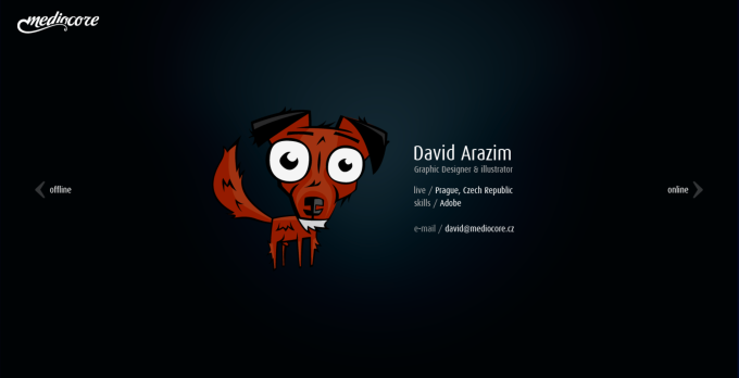
This portfolio is separated into online/web work, offline/illustration work, and a contact page. The work is presented in a slide show on a black background. The site itself is easy to navigate, but it feels empty. I think there needs to be a description of the work being displayed just so that the viewer knows what they’re looking at.
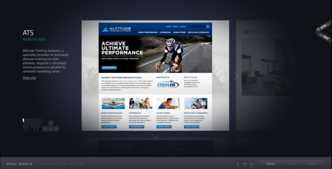
Paul’s site is separated into work, photos, and an about me page. His work is displayed like a slide show with a description of the project and what role he had in it. I like the fact that he is giving background information as well as links to the actual websites that are being shown in the screenshots. The portfolio gives enough information without being overwhelming.


This portfolio is set up in four different styles but they all contain the same pages. There is an about page, social media links, contact information, and pages for work separated into 3D & motion and web & identity. This portfolio site is a little overwhelming with the different styles that you can choose from. There also isn’t a lot of information about the work being presented, some of the pieces have a brief description but more information would be nice. I think that one style would be enough for this portfolio.
